2021.04.26 - [프론트엔드/bootstrap] - [bootstrap]칼럼사이즈조정, 어떻게 pc와 모바일에 적용되는가?
[bootstrap]칼럼사이즈조정, 어떻게 pc와 모바일에 적용되는가?
2021.04.26 - [프론트엔드/bootstrap] - [bootstrap] 부트스트랩 그리드, 12그리드시스템 Title html 페이지의 기본 구성 요소가 적혀 있다. 여기서 편집을 통해 페이지를 구" data-og-host="silvering0.tistory.c..
silvering0.tistory.com
<!DOCTYPE html>
<html lang="en">
<head>
    <meta charset="UTF-8">
    <meta name=""viewport" content="width=device-width, initial-scale=1.0">
    <title>Document</title>
    <link href="https://cdn.jsdelivr.net/npm/bootstrap@5.0.0-beta3/dist/css/bootstrap.min.css" rel="stylesheet" integrity="sha384-eOJMYsd53ii+scO/bJGFsiCZc+5NDVN2yr8+0RDqr0Ql0h+rP48ckxlpbzKgwra6" crossorigin="anonymous">
    <script src="https://cdn.jsdelivr.net/npm/bootstrap@5.0.0-beta3/dist/js/bootstrap.bundle.min.js" integrity="sha384-JEW9xMcG8R+pH31jmWH6WWP0WintQrMb4s7ZOdauHnUtxwoG2vI5DkLtS3qm9Ekf" crossorigin="anonymous"></script>

</head>
<body>
    <div class="row">
        <div class="col- lg-3 col-md-4 col-sm-6" style="background-color: red;">
            A
        </div>
        <div class="col- lg-3 col-md-4 col-sm-6" style="background-color: blue;">
            B
        </div>
        <div class="col- lg-3 col-md-4 col-sm-6" style="background-color: yellow;">
            C
        </div>


</body>
</html>
이전에는 사이즈에 대한 언급을 1번만 했다.
하지만 복합적으로 사용이 가능하다.
col- lg-3 col-md-4 col-sm-6
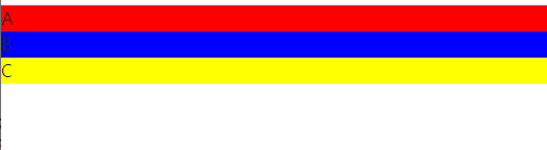
이렇게 lg, md, sm 에 대해 모두 선언을 동시에 해주면 아래와 같은 결과를 만나볼 수 있다.
1. col-lg-3
라지일 경우에 3칸씩 차지한다.

2. col-md-4 중간사이즈에서 4씩 차지한다.
c 가 아래로 내려간 모습이 확인된다.

3. col-sm-6
작을 때에는 모두 아래로 정렬이 된다.
'프론트엔드 > bootstrap' 카테고리의 다른 글
| [bootstrap] 부트스트랩 템플릿 사용법 (0) | 2021.04.26 |
|---|---|
| [bootstrap] components 01 (0) | 2021.04.26 |
| [bootstrap]칼럼사이즈조정, 어떻게 pc와 모바일에 적용되는가? (0) | 2021.04.26 |
| [bootstrap] 부트스트랩 그리드, 12그리드시스템 (0) | 2021.04.26 |
| [Bootstrap]부트스트랩이란? (0) | 2021.04.26 |